Intuit QuickBooks | Product Feature Motion
From subtle micro-interactions to large-scale animations, motion design plays a crucial role in transforming complex interactions into intuitive and engaging experiences. Explore a selection of product feature motion works led by me, demonstrating how I've utilized motion to tackle specific usability challenges and deliver solutions that delight users and drive product success.
QuickBooks aimed to launch a new card reader with a unique design and enhanced features. The challenge was to showcase these benefits in a visually engaging way that would capture the attention of potential customers and spark interest.
Node Card Reader Order
Design Explorations
By collaborating with visual designers, design technologists, and product teams, we embarked on an exploration of 3D motion design and technical feasibility within the context of the card reader flow. We focused on the "Bundle Overview" screen, showcasing the card reader and charging stand, and started with the Asset Evaluation Strategy:
We tested various 3D asset formats (PNG sequences, MP4, JSON, SVG) to assess their impact on file size, visual fidelity, scalability, and platform compatibility (iOS, Android).
MP4 emerged as a strong option, offering a good balance between visual quality and file size, sometimes comparable to static assets, making it versatile across use cases.
With the format locked, We explored 2 design options:
Technical Challenges:
File size limitation
While 3D motion offered exciting creative possibilities, we faced technical constraints related to file size and performance.
Finding a balance between visual quality and optimized loading times was crucial. I experimented with compression algorithms to reduce file sizes while maintaining image quality, balancing bitrates, frame rates, and resolution, then tested with engineers for the best configuration.
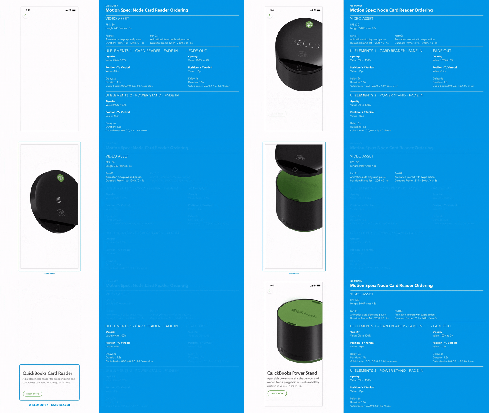
Option 1: A single MP4 asset with seamless 3D motion and scroll interactivity.
Option 1
Option 2
Delivery + Implementation
Through rigorous testing and optimization, we successfully overcame the file size limitations for Option 1, with a 7.5sec of 2k MP4 asset to stay within the 1MB size limit. To bridge the gap between design and development, I created detailed motion specs that outlined the precise animations, interactions, and transitions for the 3D visualization. These specs included:
Timing and Easing: Precise instructions on the duration and easing curves for each animation, maintaining a consistent and natural feel. Interactive Elements: Guidance on how the scroll interactivity should trigger specific animations, creating a responsive and engaging user experience.
I worked closely with the engineering team throughout the implementation process, providing guidance and feedback on optimizing the asset loading and playback to ensure the final product accurately reflected the intended design.
Impact
This resulted in the 3D visualization being seamlessly integrated into the Node Card Reader order flow across various platforms without compromising performance or loading times, contributing to a positive user experience and driving sales.
Option 2: Two separate MP4 assets
with 3D motion, also with scroll interactivity.
Challenge
Traditional product photography and static images felt limiting. Our team wanted to create a more immersive and interactive experience that would allow users to explore the card reader from all angles and understand its functionality.
Datagrid
UX Modernization
As QuickBooks embarked on a multi-year visual refresh initiative, a critical challenge emerged: transforming outdated and inconsistent UI elements into a modern, cohesive experience. The transition involved migrating from multiple design systems and legacy code to a unified design system and a modern React framework. One of the first steps in this ambitious undertaking was tokenization, followed by patternization – creating reusable templates to streamline the design and development of complex UI components.
The Datagrid, a key component for displaying and interacting with structured data, suffered from outdated design and inconsistent code. The goal was to redesign this critical component, improving usability and visual appeal while adhering to the design system.
Motion Approach
To tackle this challenge, we took on a complete redesign, focusing on both how it looked and how it worked. Using the new design system as our guide, we created a cleaner, more modern look that fits in with the overall style of QuickBooks. Leveraging the newly established Motion Tokens and Principles, we implemented subtle animations that make the experience smoother and more engaging.
Add New Item
The "Add New Item" feature was a frequent entry point for users, and we wanted to make this transition as seamless and engaging as possible.
We wanted it to be as easy and natural as possible to add new row. So, we designed a special tray that slides in smoothly when you click the button. This makes adding new items feel less disruptive and more like a part of the overall flow of using the Datagrid.
Skeleton Loader
One of the biggest pain points for users was the wait time while data loaded. To address this, we added skeleton loaders. These are like visual placeholders that show you the rough shape of what's coming, so you're not just staring at a blank screen. It's a small change, but it makes a big difference in how quickly the Datagrid feels to use.
The path to a successful Loading Framework was paved with thoughtful exploration and iteration, especially when balancing the need for adaptability, scalability, consistency, accessibility, and performance optimization.
Challenge
Creating a loading animation that was both engaging and subtle enough not to distract from the overall user experience. Additionally, determining the most effective animation style for conveying a sense of progress and activity within the skeleton structure.
Process
We explored several motion styles:
Waving: Sequentially delaying the animation of each cell/box/bone from left to right and top to bottom. The staggered timing creates a smooth, wave-like effect that ripples across the screen, enhancing the visual appeal and drawing the user's attention.
Pulsing: All elements are animated simultaneously with a subtle pulsing effect, creating a rhythmic expansion and contraction that draws attention without overwhelming the user.
To ensure the pulsing effect met user expectations and design goals, I created a ProtoPie prototype, allowing for quick feedback and real-time interaction. This prototype enabled stakeholders to experience the effect firsthand, facilitating faster iterations and more informed decision-making during the design process.
Tray Area
Tray Content
Sticky Footer
By providing clear and detailed motion specs that leveraged motion tokens, I fostered effective collaboration with engineers. We regularly reviewed the animations together, discussing any technical constraints or implementation challenges. This iterative feedback loop, guided by the shared language of motion tokens, ensured that the final motion design was both visually appealing and technically feasible.
Considerations + Outcome
We evaluated each option based on user feedback, visual appeal, ability to convey a sense of progress, and potential for distraction.
While the waving motion offered a clear sense of directionality, it could feel too busy and potentially distracting in complex layouts. The pulsing motion provided a unified rhythm but lacked a distinct sense of progression. Ultimately, we chose the 3-second loop with a 1-second pause. This balanced visual interest, a subtle sense of progress, and minimized distraction. The pause also added a touch of organic movement, making the loading state feel more natural and less mechanical.
Delivery + Implementation
Challenge: Ensuring that the loading indicators were easy for developers to implement consistently across the platform, without compromising performance or accessibility.
Process: We worked closely with engineering teams to create a modular component library for the loading framework. We also provided comprehensive documentation and guidelines, including code snippets and best practices.
Outcome: The modular approach and detailed documentation enabled seamless integration of loading indicators into various parts of the QuickBooks product, ensuring a consistent user experience across different features and platforms.
Challenge
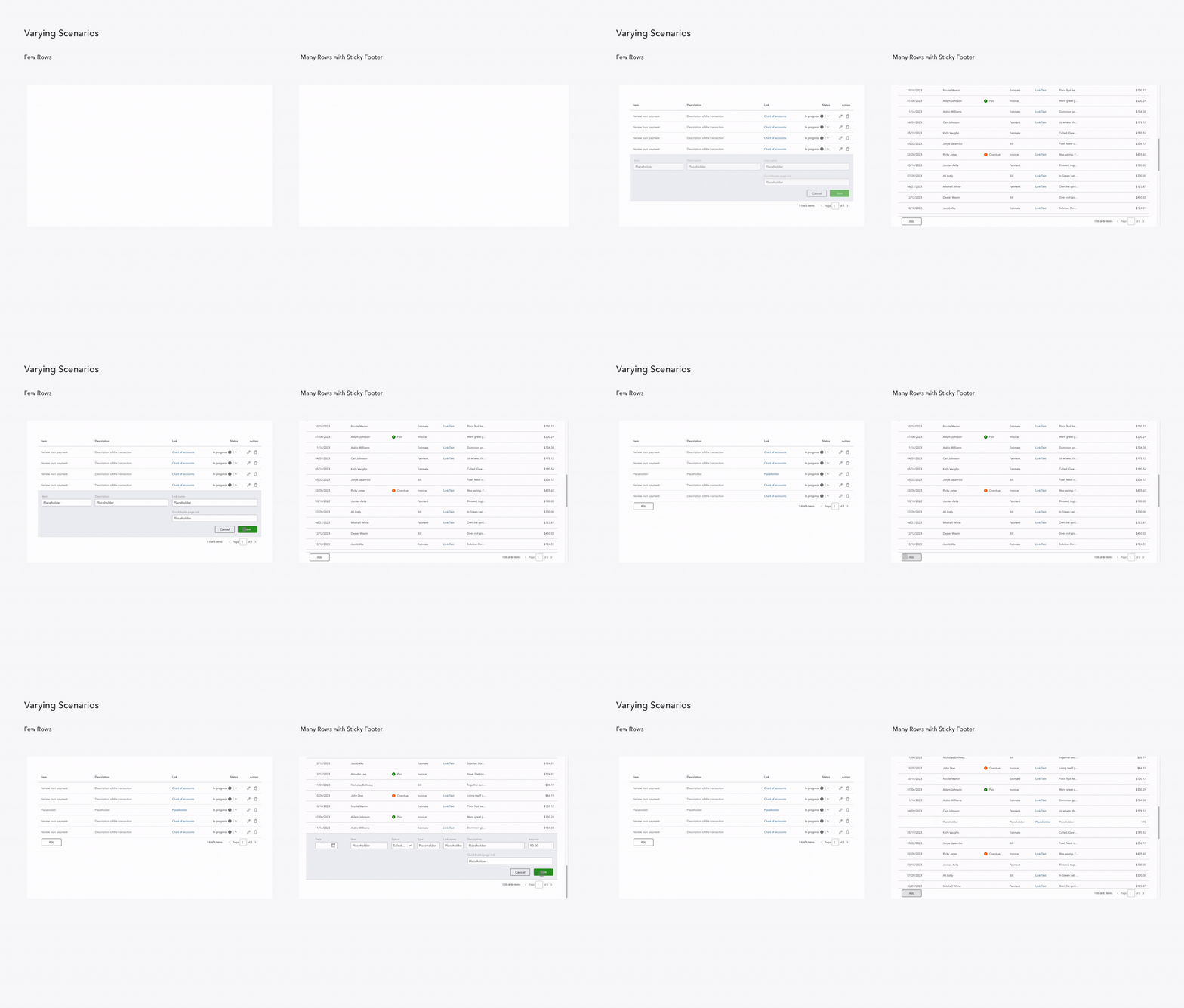
Designing a smooth and engaging transition for the "Add New Item" tray that seamlessly integrates with the existing Datagrid interface and avoids abrupt or jarring movements. Additionally, ensuring the animation adapts to different scenarios, such as varying row counts and the presence of a sticky footer.
Process
We explored several animation options, including slide-in and fade-in transitions, while also considering the following factors:
Row Count: Some users may have a small number of rows in the Datagrid, while others may have dozens or even hundreds. The animation needed to adjust accordingly to avoid obstructing content or pushing elements off-screen.
Sticky Footer: In cases where the Datagrid has a sticky footer, the tray animation needed to interact with the footer smoothly, either sliding above or below it.
User Expectations: We conducted user testing to gauge preferences for different animation styles and gather feedback on the overall user experience.
Outcome + Implementation
We opted for a slide-down animation that starts from the top of the Datagrid. This approach mimics the natural feeling of a tray expanding from nothing, providing a clear visual cue that new content is being added
Motion Spec Delivery
To ensure seamless implementation and a shared understanding of the intended motion design, I developed detailed motion specs using a standardized set of motion tokens. By leveraging these tokens, we could ensure consistency across different animations and streamline the handoff process to Engs.
Component Breakdown
Intuit Assist is a revolutionary generative AI-powered financial assistant designed to help individuals and small business owners make smarter financial decisions with confidence. My focus was crafting intuitive motion UI elements that seamlessly integrated with the AI capabilities, enhancing the user experience and guiding them through complex financial landscapes.
I am unable to share specific details about this project at this time. Please feel free to reach out to me directly to learn more about my contributions to Intuit Assist.


